Anyone can design a logo right? Of course! As long as you have the right tools, anyone can do it.

Yes, REALLY.
But, does the logo speak to your audience? Does it reflect your business? Your brand? Now that’s when it becomes tricky.
We were in the same predicament a few months back when we were starting out. It took us long enough just to think and decide on the name ‘Satsuma’ for our new marketing agency, so you can imagine it took us even longer to design our logo. You can read about why we’re called Satsuma here.
AND not to mention we were going through this process during…yes…during the Christmas period! Good thing our families were understanding enough, and didn’t decide to disown us!
So, back to the logo. Or shall we say….logos…
We definitely went through many designs, sketching on everything from notepads to napkins! I kid you not! But a logo isn’t just about imagery, it’s about the typeface too…the message you’re trying to communicate, AND colours….oh, don’t get me started on colours.
Note to self: next blog topic…checked ✓
Eventually, we shortlisted the 4 designs you see above. They were the, shall we say, the ‘chosen’ ones we thought was worthy of our time to work and develop on…and after countless revisions (more than we care to remember), we finally decided on no. 4 (yes, the one of the far right).
Why no. 4?
Cause we wanted something that reflected our approach to how we’ll be running our agency – like a satsuma. It’s bold, fresh, zesty, easy peeling with no hidden pips, and oh go on then…perhaps a nice green leaf to top it all off for good measure. Easy, no?
If you fancy having a go, here are some tips to bring out your creative juices:
1. Colours
Choosing the right colour palate for your logo – this should be fun! It should reflect you, your business and what you stand for. At Satsuma, we decided to embrace the boldness of it all, and went all orange (#ff671f to be exact). The colour is often associated with joy and sunshine; represents happiness and creativity; and as a bonus, it has very high visibility!

Colours carry meaning and communicate ideas, so choose wisely!
2. Typeface
Choosing the right typeface is a critical part of the logo design process – many brands are wordmarks, relying entirely on typography to convey their message. Think Google, NHS, John Lewis, M&S, Next, H&M, Zara…the list goes on. Just don’t go Comic Sans on me!
We didn’t even dare to venture down the Comic Sans route…but toyed with Indulta Semiserif and Idealist Sans instead. Like most things, it took a while, but we chose Idealist in the end, in keeping with our aim to achieve a design that is clean and simple…which brings us to point 3…
3. Keep it simple
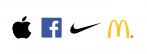
Try to keep it simple if you can. You don’t want your customers to be scratching their heads going ”what’s that?” do you? Sometimes, less is more. Don’t believe me? Here are some simple, highly effective, valuable and recognisable brands around.
 4. Next on the list is….balance.
Consider proportion and symmetry and more importantly, achieving the right balance when all your elements come together. There’s this thing called the Golden Ratio, which, if you are interested, can read all about it here. It’s a good read, promise! You can’t really go wrong if you follow the Golden Ratio rule.
5. Negative space
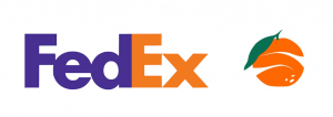
Just in case you didn’t know what negative space means, it’s the space around the subject matter. Plenty of brands have cleverly used the negative space to make their logos unique, but the one that has really stood the test of time (and my personal favourite) has to be that FedEx logo. As for us, the satsuma was our subject matter. To convey our ‘easy peeling’ approach, we thought “why not peel the satsuma?”, and that was when the Eureka moment hit us on the head like a right big old anvil! Eh Voila! We have a logo!
 6. Last but not least….loads and loads of cups of tea
Keeping your body hydrated is essential during the design process. We like tea at Satsuma HQ. Actually, it’s just me who likes tea (and it has to be brewed for more than 6 minutes!). Dirk is more of a coffee person. But hey, whatever floats your boat. The beverage of choice is entirely up to you. You could even go all rogue and opt for the H2O!
And this my friend, brings us to the end…
We’ve certainly had loads of fun (and tea/ coffee) creating our logo, and we’re super proud of it. We hope you like it too and would love to get some feedback or comments. Good or bad*.
*We promise to take the good ones (and most probably bin the bad ones).